ダッシュボードのレイアウトを作るときに「フッターを下部に固定するにはどうするんやっけ?」って、よくなるのでメモ!
やり方
※ すぐに試せるようにCDNでTailwind CSSを読み込んでいます。

Use the Play CDN to try Tailwind right in the browser without any build step.
tailwindcss.com
とりあえず必要なところだけ
<!DOCTYPE html>
<html lang="ja">
<head>
  <meta charset="UTF-8">
  <meta name="viewport" content="width=device-width, initial-scale=1.0">
  <script src="https://cdn.tailwindcss.com"></script>
  <title>DashboardLayout</title>
</head>
<body class='flex flex-col h-screen w-screen'>
  <header>Header</header>
  <main class='flex h-full'>
    <aside class='w-1/6'>Sidebar</aside>
    <section class='w-5/6'>MainContainer</section>
  </main>
  <footer>Footer</footer>
</body>
</html>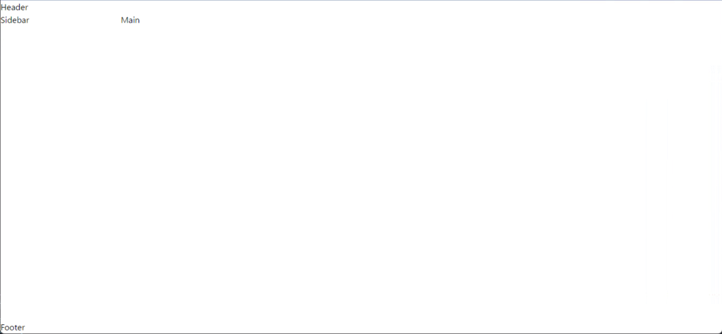
色を付けてわかりやすく
<!DOCTYPE html>
<html lang="ja">
<head>
  <meta charset="UTF-8">
  <meta name="viewport" content="width=device-width, initial-scale=1.0">
  <script src="https://cdn.tailwindcss.com"></script>
  <title>DashboardLayout</title>
</head>
<body class='flex flex-col h-screen w-screen'>
  <header class='bg-red-500'>Header</header>
  <main class='flex h-full'>
    <aside class='w-1/6 bg-yellow-500'>Sidebar</aside>
    <section class='w-5/6 bg-green-500'>MainContainer</section>
  </main>
  <footer class='bg-blue-500'>Footer</footer>
</body>
</html>
ユーティリティクラス
flex flex-col
子要素を垂直方向へ配置
h-screen w-screen
高さと幅を画面サイズいっぱいにする
h-full
高さを親要素いっぱいにする
w-1/6 w-5/6
幅を指定の比率にする